
Bootstrap 4: Flex Box


Compare with Bootstrap 3, Bootstrap 4 has added many new functions and made some changes. Flex box is one of the new functions.

According to the course instructor, flex box includes a bunch of CSSA properties to move things around the position elements inside of a container instead of a page.

Basically, flex box is a model for positioning content inside a box.

Let's see some flex box examples.

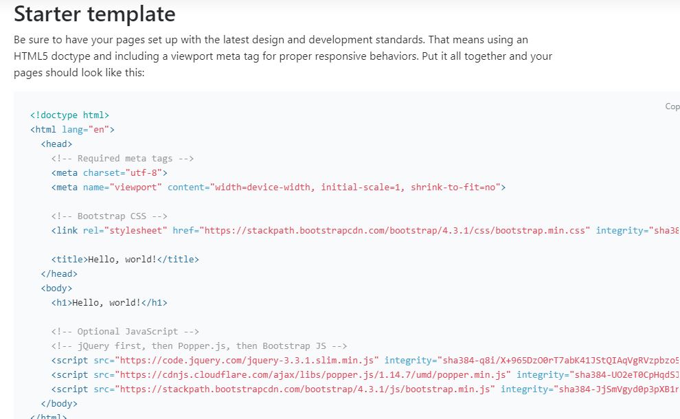
Bootstrap 4 has a new starter template which includes the latest design and development standards. Therefore, I just copy the HTML template on my code editor.


Then, I create two buttons inside a container and add a border to the container. This will help you to see how those buttons move inside the box.

Justify-Content (Move in Row)


To make two buttons move to the left in the flex box, we need to add a property value: "d-flex". It means "display flex", and it will help to set the directions. For the default value, the items are on the left.


The result: the blue and yellow buttons are directed to the left.


If we want to move the buttons from the left to the right or to the center, we only need to add "justify-content-end" (display right) and "justify-content-center"(display center) property value after "d-flex". By the way, "justify-content-start" is displayed to left.


The result:


If you want to have some space between each button, you can set "justify-content-between" and "justify-content around" value.


The result:


Align-Item (Move in Column)

There is not only a left-right direction, but it also has a top-bottom direction. We can also set three common values : "align-items-start" (display top), "align-items-end" (display bottom), and "align-items-center" (display center).


The result:


Flex Reverse

If we want the large button moves from the first button to the last button, and the small button moves from the last to the first, we can set "flex-row-reverse" and "flex-column-reverse" value.

Flex-row-reverse refers to the items in the box are reversed in a row (left-right). Flex-column-reverse refers to the items in the box are reversed in the column (top-bottom).


The result:


Comments

Popular posts from this blog

Intermediate Express.js: How To Add Styles & Partials in EJS File?

So far, we only have simple HTML tags and ejs tags in each ejs file. Every template page has no style at all. And the basic HTML header and footer are also missing. Today, I learned how to add styles and partials in ejs file. Link Style Step One: Touch a Separate CSS file I create a new directory "Style" under the "EJSDemo" directory, then I add a new CSS file "app.css" inside "Style" folder. Step Two: Add app.use(express.static()) in the app.js I add app.use(express.static("style")) in the "app.js". This will tell Express.js to serve the content of "Style" directory. Step Three: Write styles in CSS file I simple give body an orange background color and set text color to be grey. Step Four: Link to CSS file in the EJS file I just add <link> tag to link the "app.css" file on the top of the h1 tag in each ejs template. As the result, when I run the app and...

Intro to Backend: Is Browser The Only Place To Send HTTP Request?

Today,  I begin to learn the second part of web develop course: backend. Frontend is the stuff that we can see and interactive with, such as HTML, CSS, and JS. We can type our code, style our page, or write some function to make interaction. However, backend is everything else. For example, we type Target web address in the Internet Browser. As we hit "enter", there are a few steps to go through: 1. The HTTP request is sent to a particular server's IP address. 2. The server figures out what to send us 3. It sends a HTTP response back to us Those process we are hard to see, and it happens in less than one second. The instructor said that the browser is not the only place to send the HTTP request, and there are so many choices out there. In this learning course, we are going to use Postman App . Postman allows us to make HTTP requests and viewer responses. It is really for developers to understand how things are working or debug something. In the P...

Intermediate CSS: Three Steps To Create A Photo Gallery

I have seen many image blogs these years. People love to post their photos online to express life and feeling.  Image is powerful because it could bring a visual story to audience. People can see what you see, and may be feel the same way as you feel, too. If we want to build our own photo gallery, what should we do? Luckily, the boot-camp instructor just showed me how to use HTML and CSS to create a simple photo gallery.  I would love to share my study note here. (p.s. all the image links are provided by Udemy course instructor) Step One: Add Image Links on HTMLPage The instructor provides all the image links. All we need to do is add those links inside the <img> tag. Without CSS, the page will looks like this: they are not organized, and sizes are different, too. Step Two: Set Image Property Values We set the width of each photo the same value which is 30%, so there will be three images per line. The percentage value can help...